
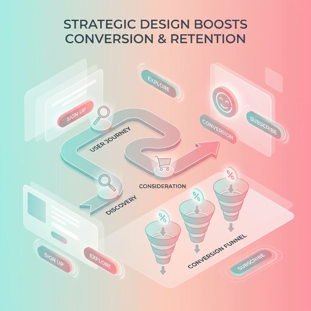
How Strategic UI/UX Design Increases Conversions and Retention
See how strategic UI/UX design increases conversions and retention — the fixes that work, the metrics that prove it, and the ROI claims to ignore. Start here.
Introduction
Most websites do not have a traffic problem. They have a translation problem — visitors arrive, understand roughly what is on offer, and then quietly leave at the exact same three or four points. The analytics show it every month. Nobody can explain it, so the conversation defaults to "we should probably refresh the design."
Strategic UI/UX design is what turns that vague instinct into a diagnosis. It treats the interface as a sequence of decisions the user has to make, finds the ones where confidence breaks down, and removes the friction causing it. Done properly, it moves two numbers at once: the conversion rate on the way in, and the retention rate on the way through. Most agencies talk about the first and ignore the second — which is why so many redesigns produce a short spike and a long flat line.
This guide covers both. You will get the mechanism behind how UX design increases conversions, the specific leaks that cost the most money (forms and checkout, with primary-source data), the retention side that rarely gets designed at all, a step-by-step UX audit process, the metrics that prove the work paid off, and an honest look at the UX ROI statistics circulating in agency pitch decks — including which ones do not survive a source check.
Key Takeaways: Strategic UX as a Conversion & Retention Engine
Strategic UX design directly converts user attention into measurable enterprise value across the customer lifecycle:
Strategic UX design ties interface decisions directly to business outcomes — conversion rate, retention, and customer lifetime value — rather than treating usability or aesthetics as ends in themselves.
Conversion lift comes from friction removed, not persuasion added. Core HCI principles — Cognitive Load Theory, Hick's Law, Fitts's Law, and Jakob's Law — explain the vast majority of drop-offs on commercial websites.
Forms and checkout are the best-evidenced leak: Baymard Institute puts average documented cart abandonment at 70.22% across roughly fifty studies, with a 35% conversion lift recoverable through checkout UX fixes alone ($260B in US/EU orders).
Retention is the half nobody designs: onboarding time-to-first-value, remembered user context, post-purchase clarity, and honest cancellation flows determine whether a converted buyer becomes a recurring customer.
The "$1 in UX returns $100" / 9,900% ROI statistic does not survive a source check. Measure on your own funnel instead: record a baseline, ship targeted UX fixes, and measure the delta over a full business cycle.
Audit before redesigning: 2 to 4 weeks of structured UX diagnosis usually reveals that an expensive rebuild was aimed at the wrong problem.
What Strategic UX Design Actually Is
Strategic UX design is user experience work tied directly to business outcomes — conversion rate, retention, customer lifetime value — rather than usability as an isolated design exercise. It starts from behavioral analytics, identifies where users hesitate, and redesigns those high-friction moments.
UI Design vs. UX Design: Who Owns Which Outcome
- UI Design Scope: The visible interface — typography, color palette, component states, visual hierarchy, and motion design.
- UX Design Scope: The full journey — customer research, information architecture, user flows, cognitive friction removal, and usability validation.
- Primary Metrics: UI owns trust and comprehension (reducing bounce rates); UX owns task completion (driving conversion and retention).
Conversion-Centered Design: Each screen is engineered around a single desired commercial action, with every element evaluated on whether it guides the user forward or introduces cognitive distraction.
Failure Modes: Weak UI makes a site look amateur and undermines credibility; weak UX makes a site unusable, causing visitors to abandon without completing their intent.
Visual vs. Structural: Explore our guide to web design trends that matter for business growth for the visual and accessibility landscape.
Core Services: Discover our website UI/UX design services that diagnose and fix funnel leaks systematically.
Why UX Design Increases Conversions: The Actual Mechanism
Conversion is not persuasion; it is the systematic removal of reasons to stop. Four well-established principles from human-computer interaction govern user behavior on business websites:
Cognitive Load Theory: Working memory is strictly limited. Every unexplained term, extra decision, or competing message degrades task completion.
Hick's Law: Decision time increases logarithmically with the number and complexity of choices. Six navigation items consistently outperform sixteen; one primary CTA outperforms three.
Fitts's Law: Time required to hit a target depends on its size and distance. Small tap targets and distant CTA buttons depress mobile conversions.
Jakob's Law: Users spend most of their time on other websites and expect yours to work the same way. Inventing novel navigation or checkout patterns transfers cognitive burden to the customer.
High-Impact UX Changes That Move the Needle
When allocating development resources, prioritize the design interventions that deliver the fastest commercial returns:
Above-the-Fold Proposition: State clearly what you do, for whom, and what happens next within the first screen without requiring scrolling.
Form Field Reduction: Cut form fields to what your sales team will act on immediately. Phone number optional beats phone number required in every test.
Predictable Navigation & IA: Ensure information architecture reflects customer search intent rather than internal corporate hierarchy.
Contextual Social Proof: Place outcome-driven testimonials and guarantees directly beside pricing tables and primary CTAs rather than burying them in the footer.
Zero Pre-Intent Interruptions: Remove intrusive modal pop-ups on initial page load that interrupt the user before they can evaluate the offer.
Mobile Touch Ergonomics: Ensure thumb-friendly tap target sizes, single-column layouts, and native keyboard input types (numeric, email, telephone).
Where Conversions Actually Leak: Forms and Checkout Optimization
Checkout abandonment is structural: Baymard Institute's benchmark data reveals a 70.22% average cart abandonment rate across 50 studies. Over 35% of these lost orders are recoverable through deliberate UX improvements:
Unexpected Extra Costs (Single Largest Cause): Display shipping calculators in the cart and state shipping thresholds upfront on product pages.
Mandatory Account Creation (1 in 5 Abandonments): Implement guest checkout by default; offer optional, pre-filled account creation post-purchase.
Complicated Checkout Sequence: Reduce the average 23 form elements by 20–60%, use smart defaults, and provide a clear step progress indicator.
Security & Payment Doubts: Integrate recognized security badges, transparent return policies, and live support access directly within the checkout frame.
The Other Half: How UX Design Drives Customer Retention & LTV
Conversion captures attention, but retention compounds enterprise value. Retention represents a sequence of small renewals of confidence each time a customer returns:
Onboarding UX (Time-to-First-Value): Replace lengthy onboarding carousels with progressive disclosure, getting new users to their first meaningful outcome immediately.
Context Retention & Return Paths: Save previous user configurations, addresses, and order histories to eliminate the re-entry cognitive tax.
Post-Purchase UX: Optimize transactional confirmation screens, real-time shipment tracking, and self-service return workflows.
Honest Cancellation Flows: Avoid manipulative dark patterns; frictionless cancellation builds goodwill and prevents vocal public detractors.
Reading Around the Hype: UX ROI Statistics & Source Checking
The common industry claim that "every $1 invested in UX returns $100" (9,900% ROI) traces to unverified secondary citations and older IBM generalizations ($10–$100 range). While UX investment unquestionably yields high returns, reputable teams measure impact on their own funnels.
Nielsen Norman Group Heuristic: Moderated testing with just 5 users surfaces up to 85% of core usability bottlenecks in a given workflow.
Empirical Funnel Baselines: Establish baseline conversion rates, deploy isolated design interventions, and measure the delta across full business cycles.
Technical Stacks: UX performance is capped by the underlying engineering — see our Next.js and headless CMS enterprise playbook and why website performance directly impacts revenue and SEO.
How to Conduct a UX Audit & Engagement Models
A structured UX audit diagnoses conversion drop-offs across 8 systematic steps: 1) Define outcome & funnels, 2) Extract quantitative baseline, 3) Analyze session recordings & heatmaps, 4) Conduct heuristic evaluation, 5) Run moderated user testing, 6) Audit manual accessibility, 7) Prioritize by impact over effort, and 8) Establish pre-build measurement criteria.
UX Audit ($5,000–$20,000 | 2–4 weeks): Prioritized diagnostic findings and actionable recommendations for diagnosed bottlenecks.
UX Redesign ($25,000–$120,000+ | 8–16 weeks): Complete structural redesign, prototype testing, and production implementation.
UX Advisory / Consulting ($3,000–$15,000/mo): Ongoing user research, experimentation, and design system governance.
Turnkey Solutions: Explore our conversion-focused web development and website redesign services.
Measuring UX Success: Behavioral vs. Outcome Metrics
Evaluate UX effectiveness by pairing one behavioral metric with one commercial outcome metric across every stage of the customer journey:
Entry Stage: Scroll depth & time to first interaction vs. Primary landing page bounce rate.
Consideration Stage: Site search usage & path length vs. Service/product page view-to-step progression rate.
Action Stage: Form field drop-off & error rates vs. Step-by-step lead conversion rate.
Checkout Stage: Field-level abandonment & payment retry rate vs. Cart-to-order completion rate.
Retention Stage: Time to first value & return frequency vs. Repeat purchase rate, churn rate, and Customer Lifetime Value (LTV).
Conclusion
Strategic UI/UX design is an empirical business discipline that transforms digital friction into sustainable commercial growth and customer retention. By removing cognitive barriers, engineering frictionless checkout funnels, and optimizing onboarding workflows, enterprises create enduring conversion engines. To identify where your funnel is leaking revenue, explore our case studies, review our portfolio, or talk to our team about a UX audit at Belk Digital.
Frequently Asked Questions
Need Expert Help with This?
If you’re looking to implement these strategies for your business, our team can help you plan, build, and scale with confidence.
ContactReady to Transform Your Digital Presence?
Let's discuss how we can help you achieve your digital goals and create an exceptional online presence.